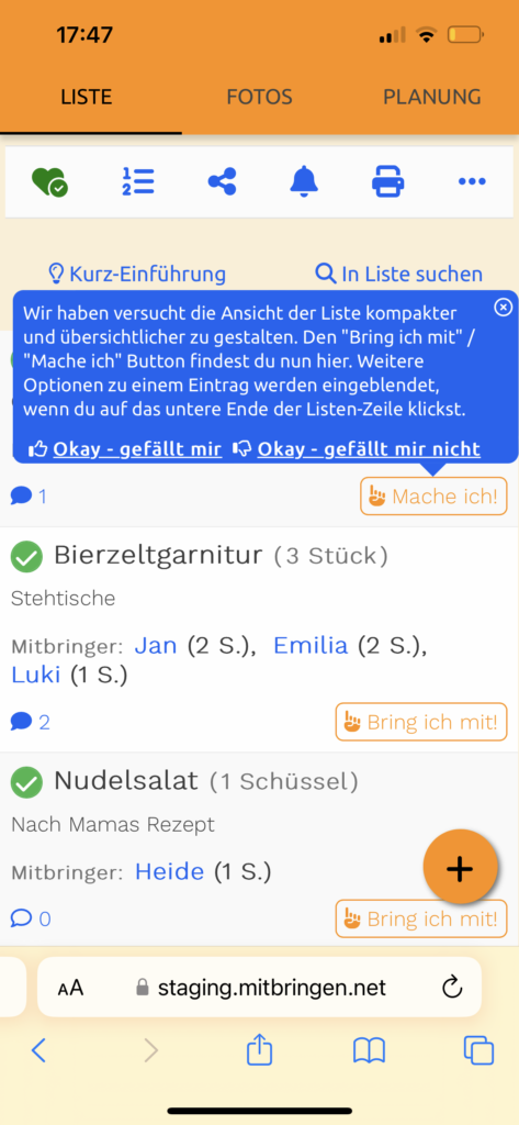
Mitbringen.net introduces compact layout
In recent months, more and more functions have been added to the Mitbring list. As a result, the layout of the list – the original functionality of mitbringen.net – has been loaded with more and more buttons and information.
After several users requested a clearer and more compact layout, and after evaluating the most important functions, the layout was streamlined and restructured. This required several intermediate steps in which minor adjustments were made and the effect on use was observed.
In the end, even a little-used function – adding so-called “reactions” to a list entry – was completely removed. This was rarely used and took up too much space.


In addition, some rarely used functions – such as deleting an entry and subsequently adding a description – are now initially hidden. The buttons have been rearranged so that the space – especially in height – is used optimally. This means that a standard list entry now takes up significantly less height and appears less cluttered. As a result, more entries now fit on one screen page, especially on mobile devices.
The new layout will now also be tested and further optimized if necessary. You are welcome to use the feedback function (via the “Contact” link at the bottom of the screen, or via the App or Playstore).
Another new feature is being tested for the first time with this change; a teaser notice that points out the new position of the “I Bring” / “I do” button when the list is opened for the first time – within the next 2 months – and also has a “Like” / “Don’t like” query built in.
Translated with DeepL.com (free version)